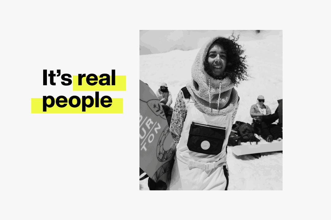
What makes an image true to Burton?
We have a rich history of capturing some of the most compelling snowboarding imagery in the world.

So what makes a Burton image feel like “Burton”?
How Burton images stay true to our purpose.
Every image has a job to do. Bring our purpose to life.
Our brand lens attributes are summarized by 3 principles rooted in our purpose:
Functionality
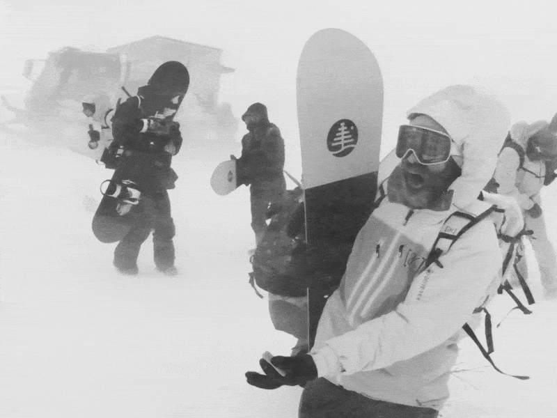
We are rooted in technical performance
and committed to quality.
Creativity
We have as much fun as possible.
We bring the spirit of riding to life 365.
Progression
We fight for the future of our sport,
people, and planet.
These principles inform what the customer feels, experiences, and is inspired by through our imagery.
For more on our creative principles view the Brand Lens Page →
This is how we show up on brand. We do this by conveying the creative lens attributes that define Burton.
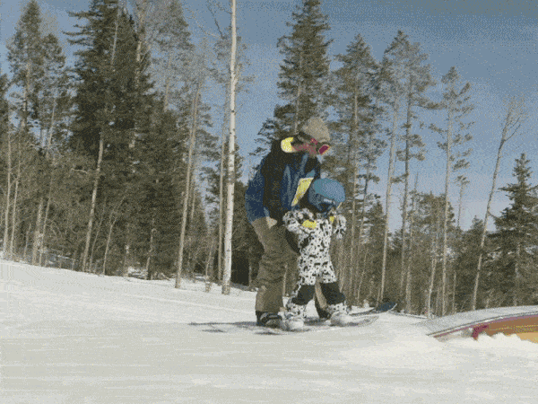
Functionality looks like this:
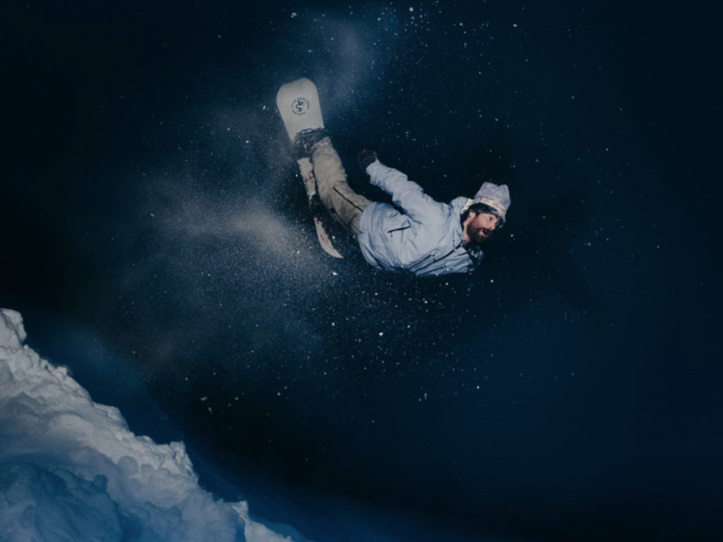
Functional imagery conveys technical performance through active moments and demonstrates the quality of the products.
Purpose Tie-In: We are rooted in technical performance and committed to quality.
Creative Lens Attributes: Trust • Quality • Innovation • Confidence

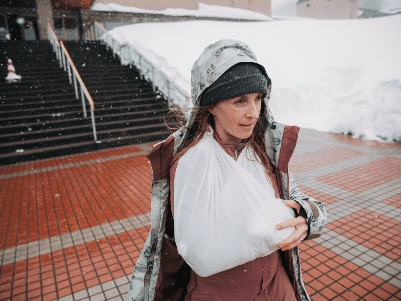
Not this:
× Overt product shots that diminish real technical performance.
× Unrealistic and misleading settings that lack expertise.
× Disconnected from nature with product not intended for setting.
× Passive moments where product is not being used.
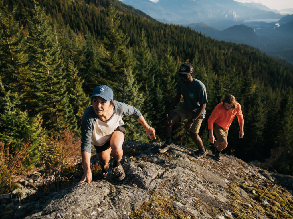
Creativity looks like this:
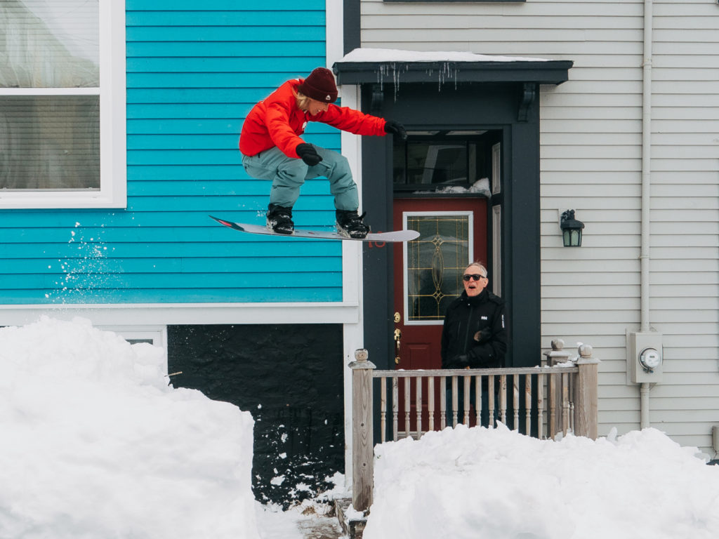
Creative imagery conveys finding freedom and an escape from everyday drudgery and feeling boxed in – to show up awake and alive – no matter where it is. It shows people doing incredible things outdoors with an element of lightness, creativity and joy.
Purpose Tie-In: We have as much fun as possible. We bring the spirit of riding to life 365.
Creative Lens Attributes: Emotion • Unexpectedness • Grit • Curiosity • Boldness

Not this:
× Lack of emotion with models posing in staged settings.
× Indifferent and uncompelling. Could be any outdoor brand.
× Predictable and expected, following widely used trends.
× Overly polished, unnatural effects with an artificial feeling.
Progression looks like this:
Progressive imagery motivates and inspires people to push convention and limits. It visualizes an inclusive community with diverse representation, elevating the voices of marginalized people. It conveys our dedication to our sport, people, and planet.
Purpose Tie-In: We fight for the future of our sport, people, and planet.
Creative Lens Tie-In: Stewardship • Conviction • Inspiration • Inclusive


Not this:
× Settling for mediocrity and whimsical moments.
× Single individuals focused on winning or being the best.
× Undiversified talent and safe/soft moments. Avoid showing women in passive poses doing less intense activities.
× Bro-centric culture that feeds snowboarding’s perception as predominantly white, young, straight, and male.