Color
Color is an extension of our brand expression. Color can build consistency, and also react and respond to the changing world and seasons around us.
Brand Colors
Our brand was born in the mountains and on snow. These are central elements to who we are and why we exist. Looking forward we are leaning into the contrast of black and white as a timeless foundation for a brand that allows for vibrancy to stand out in our seasonal palettes.
Our brand identity is centered around black and white. While our logo can be used in colored applications, it should most commonly be presented in black and white. This helps ensure clarity and consistency across all brand touchpoints.

Digital Interface Applications
Due to the perceived harshness of digital displays and RGB color space, we use a slightly softened black that still appears as true black.


It is a subtle difference but acceptable to use a black between 100% and 90% black to soften the contrast on digital displays. This is especially helpful when setting large amounts of text digitally. For example, on this site we use #1A1A1A, or 90% black.
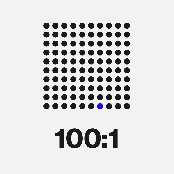
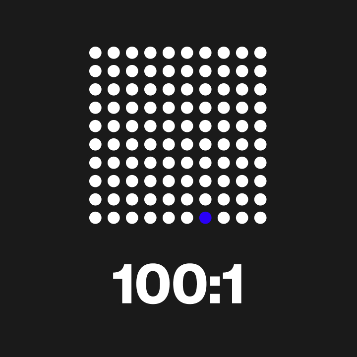
Jake Blue – Brand Code
Jake Blue is the thread that ties everything together. Jake made sure every product received his seal of approval. This brand code will show up as a design signature that unifies our brand and serves as a reminder of Jake’s legacy and passionate attention to detail.

Why (This) Blue?
- Blue was Jake’s favorite color.
- It is a future-forward blue as brands continue toward a more digital future in which digital devices heavily utilize the blue spectrum.
- Blue as a representation of planet earth, which is 71% water, and our commitment to protecting the world and its inhabitants.
- Blue in the foundational psychology of color is known to evoke peace, freedom, and unity—the feelings we get when standing sideways.
- “Freedom and Unity” also happens to be Vermont’s state motto.
- Bold and bright—just like our future.
Application
The swatches below represent the specific blue that should be used for each use case. Note: Print assets should never use an automatic conversion of the digital HEX value.

Usage
Jake Blue should show up only as an accent color to our brand colors and should be used at a ratio of 100:1.