STEP ON®
Snowboarding simplified for everyone.
From seasoned pros to first time snowboarders, Step On provides a seamless experience that caters to every style of riding.
Identity
The STEP ON® identity is an integral part to the communication strategy of the technology. The following guides aim to ensure consistent placement and standardized usage of the STEP ON® visual identity across all applications.
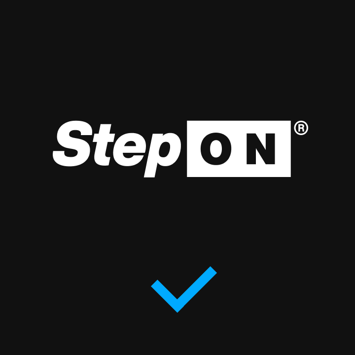
Primary Logo
This is the primary logo and should always be implemented whenever possible.
LEARN MORE
Clear Space
The minimum required spacing around the STEP ON® logo is equal to the cap-height of the “N” in “ON” and should never be altered. Nothing other than the STEP ON® logo should ever appear within this space.
Secondary Logo
This is the secondary logo variant and should ONLY be used in applications where the horizontal space is limited or in product applications where the logo appears smaller than 3/4 inch or 2 centimeters.
Clear Space
The minimum required spacing around the STEP ON® secondary logo is equal to the cap-height of the “N” in “ON” and should never be altered. Nothing other than the STEP ON® logo should ever appear within this space.
Color
Brand Color
The STEP ON® logo is always black and white, or white and black.

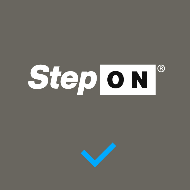
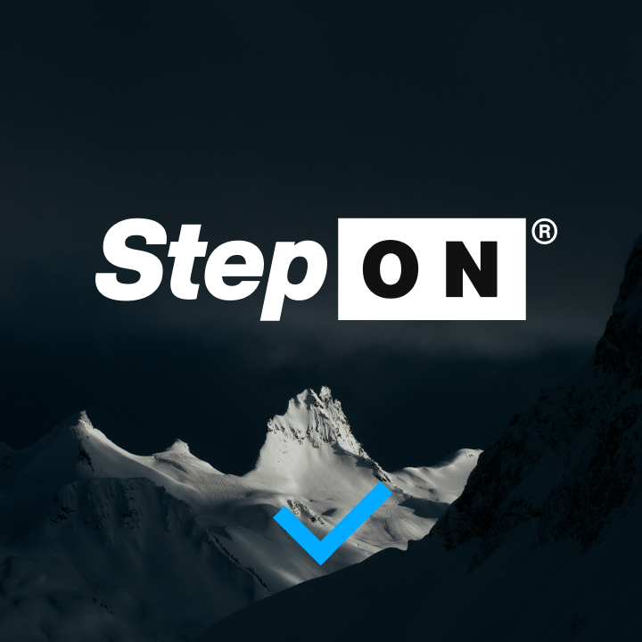
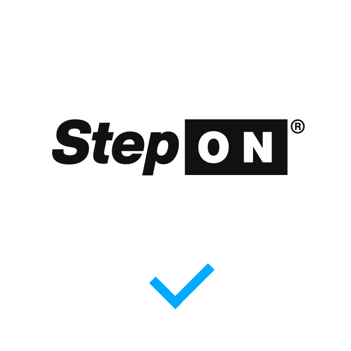
Application
Whenever applicable, a two-color, black and white, or white and black logo is preferred on all applications. However, a single-color black or white logo with knockout is acceptable if there is a printing, manufacturing, or other application-based restraint.


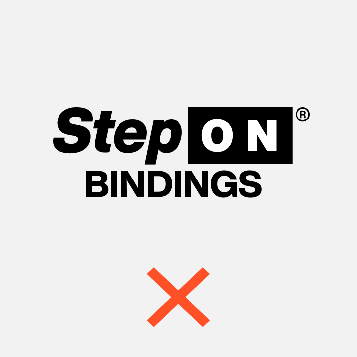
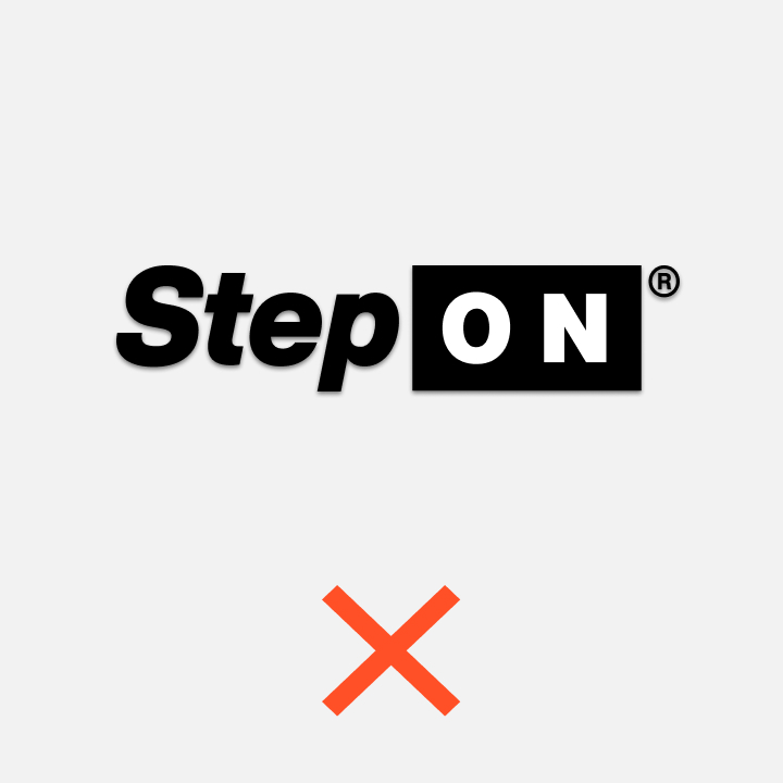
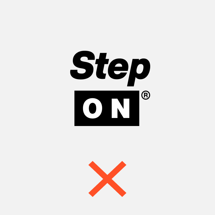
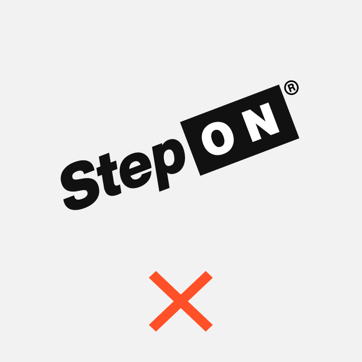
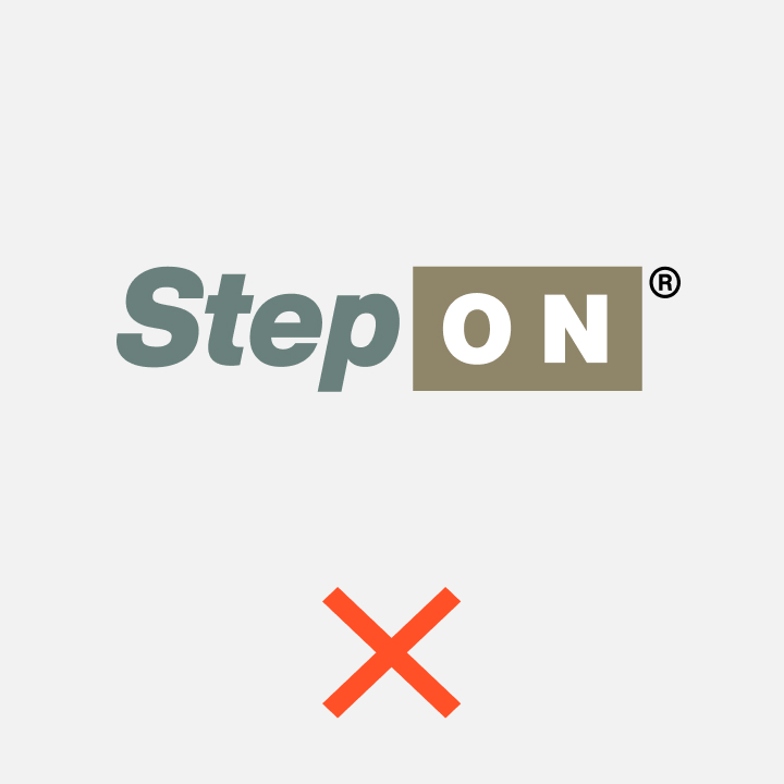
Misuse
Application of the STEP ON® logo should be kept straightforward and simple, utilize only the colors of the identity, and must not be altered or adjusted in any way.
Application
Correct logo adjustments based on the application background are outlined below.

Partnerships
Co-branding hierarchy and intellectual property
Burton Pairing
STEP ON® and Burton can be represented simultaneously
while respecting the appropriate clear space of both logos.

It is acceptable for the STEP ON® logo to stand on its own, as long as the Burton or partner branding is represented elsewhere within the application.
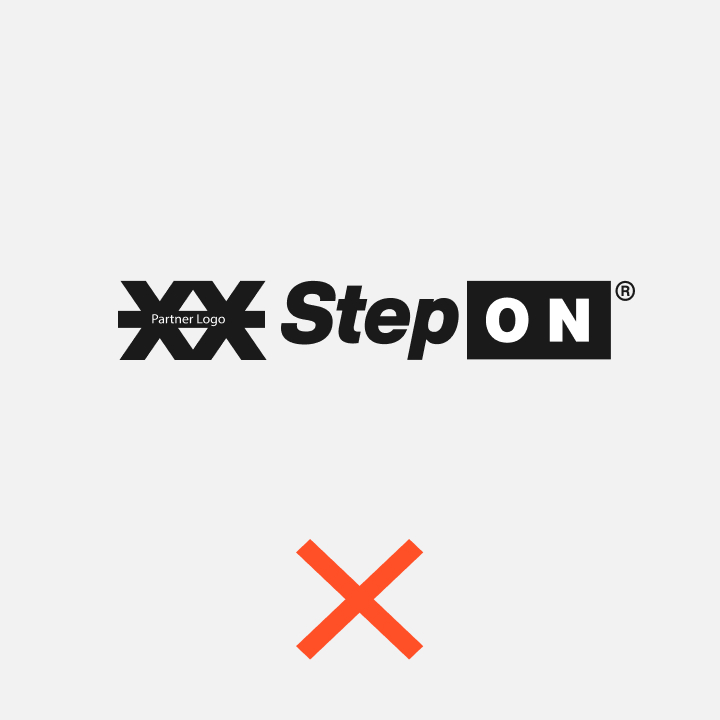
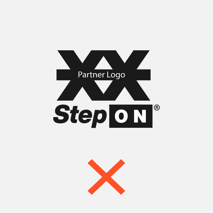
Partner Pairing
Partnership identities always require a separator when using both logos.


Misuse
Do not simply merge or integrate properties.
Partnership Communication
Communication
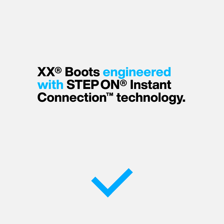
Correct. Separator.
When speaking about the technology with partner brands, a verbal separator is required to differentiate ownership of the product vs. ownership of the technology.
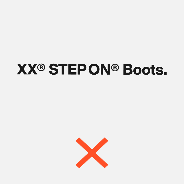
Wrong. No Separator.
This example illustrates how improper use of a separator causes confusion between ownership of intellectual properties.
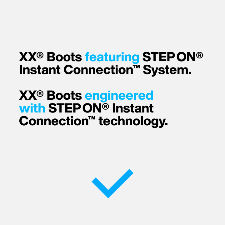
Good Examples. Inclusive.
Good examples of integrated communication showcase both the partnership and the technology in a positive way. This expresses how both entities work in concert with each other to amplify the result.
- featuring
- with
- engineered with
- designed with
- developed with
Bad Example. Passive or dismissive.
Bad examples of integrated communication are passive and speak to the partnership as if it is forced,
or required.

- incorporating
- including
- using
Attribution
Required Attribution
All instances of marketing and collateral featuring STEP ON® must also include attribution of ownership to Burton Snowboards.

Size and Placement
Placement can be anywhere on the application but it must be visible, and legible, and the text must always appear larger than 4pt.

Communication
Trademarks, taglines, translations, and supporting language
Trademark Rules
Consistency is important when protecting trademarked properties. The following table outlines correct and incorrect usage of the STEP ON® property.

Supporting Language
Technology Descriptors
While STEP ON® is a product itself, it is important to describe and include the benefit when using the trademark. While it is acceptable to include product-centric nouns like boots or bindings, it is preferred to use nouns that describe the technology benefit rather than the end result.

Step On Summary
01
Always start with the STEP ON® primary logo
02
Use the secondary logo as a last resort. Use only when space is limited or on small product applications.
03
Never alter or adjust any of these marks in any way.
04
Partnership identities always require a separator when using both logos.
05
Do not simply merge or integrate elements of partner logos.
06
All instances of marketing and collateral featuring STEP ON® must also include attribution of ownership to Burton Snowboards.