Partnership Branding
We all love a good collab. Here’s how to lockup a Burton logo with a partnering brand’s in all the right ways.
This is a succinct set of rules ensuring the consistent application of collaboration branding identities.
This page is divided into three key sections:
01 – IDENTITY
01 – Identity
Primary Logo
This is the primary logo family. These are the logos that will be used in collaboration with partner logos whenever possible.

Clear Space
Based on the grid the logo is constructed on, the wordmark is three units tall. The minimum clear space around the logo is 4 units or 1.33× taller than the cap-height.
Secondary Logo
These are the horizontal variants of the logo family and should ONLY be used when vertical space is limited.
Clear Space
Based on the grid the logo is constructed on, the cap height is 6 units tall. The minimum spacing around the logo should be at least 2 units or ⅓ the height of the letters.
02 – APPLICATION
02 – Application
Color
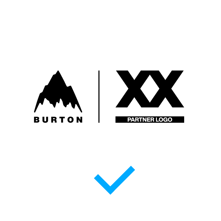
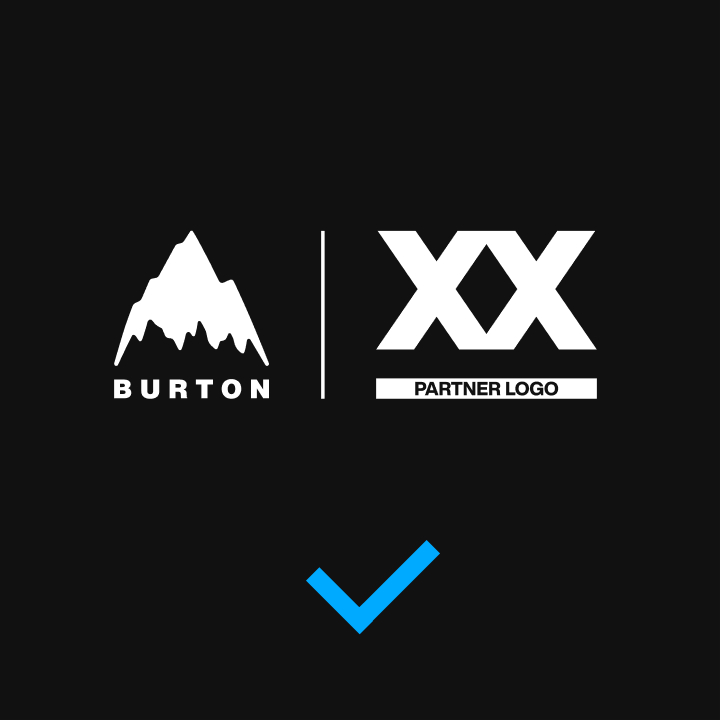
Logo lockups should always be black and white, or white and black.

Application
When we partner with brands, we want to be sure that the collaboration looks as good as it feels. This set of rules ensures the consistent application of collaborating brand identities for a tight lockup that leaves everyone happy.


Usage
Misuse
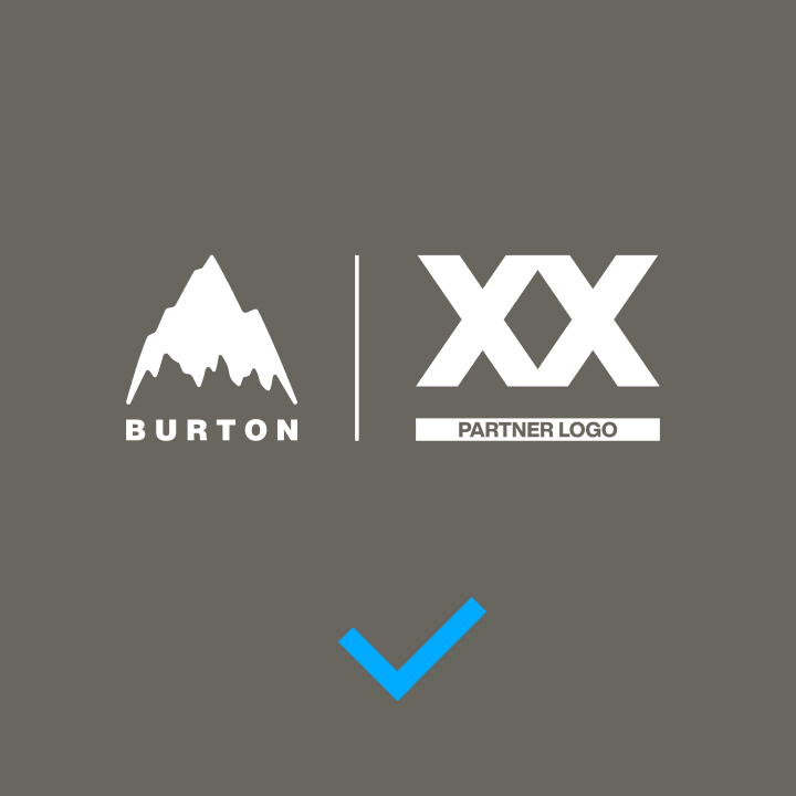
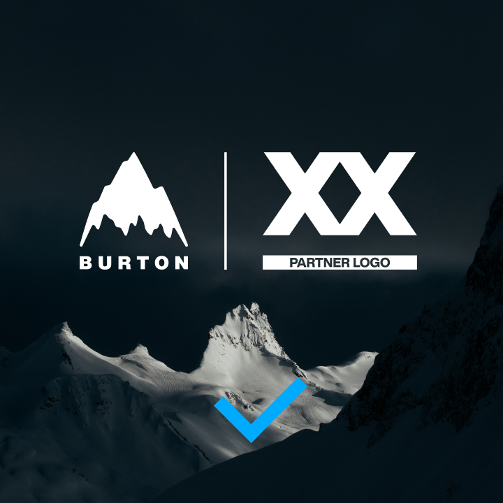
Application of logo lockups should be kept straightforward and simple, utilize only the colors of the identity, and must not be altered or adjusted in any way.
Application
Correct logo adjustments based on the application background are outlined below.
03 – PARTNERSHIPS
03 – Partnerships
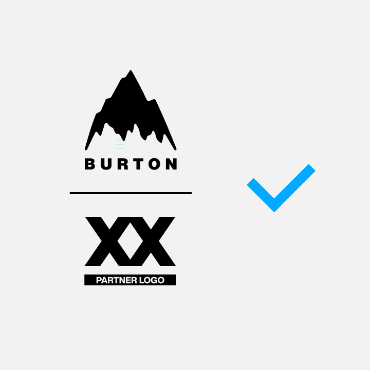
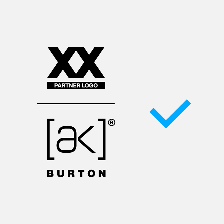
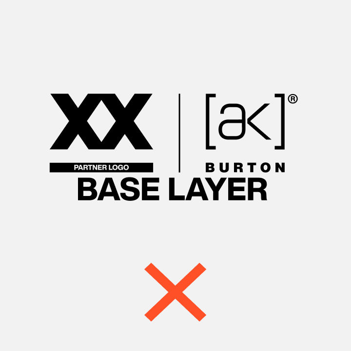
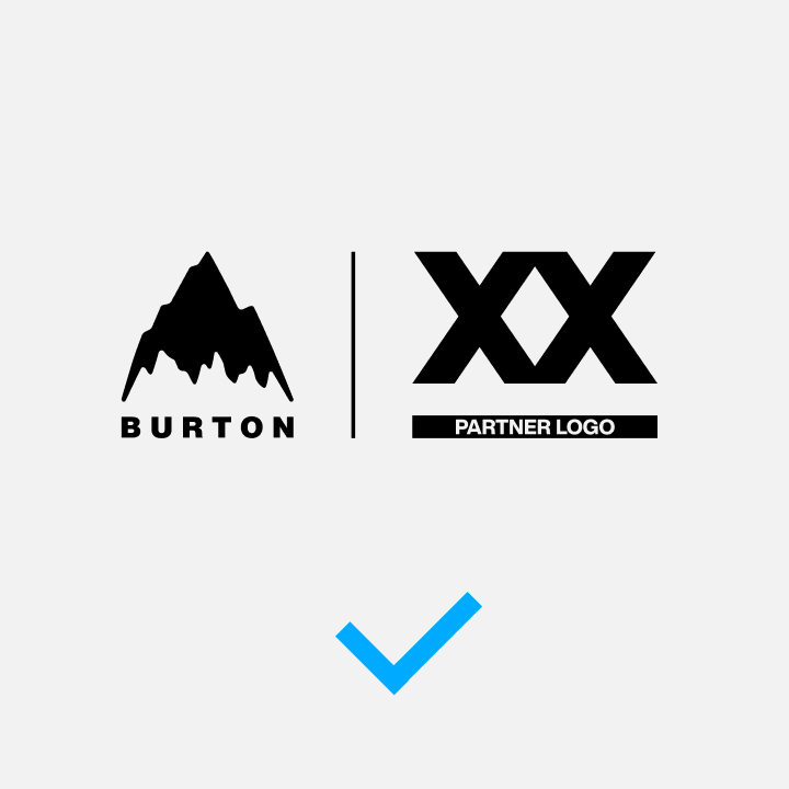
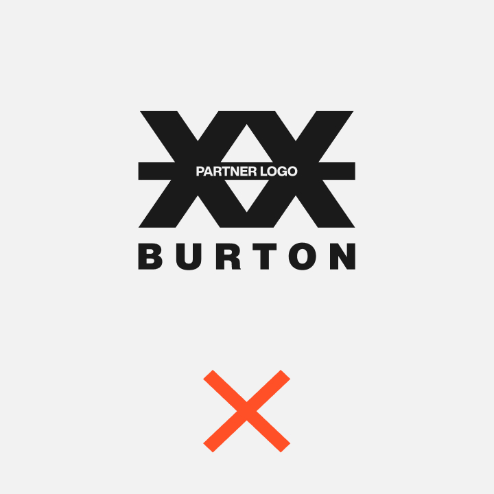
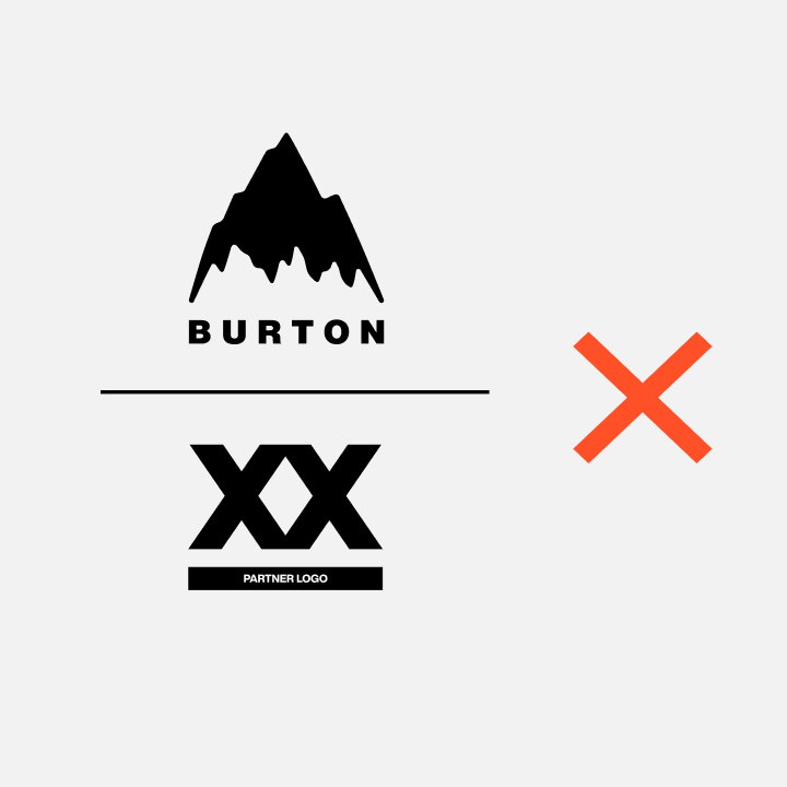
Partnership Pairing
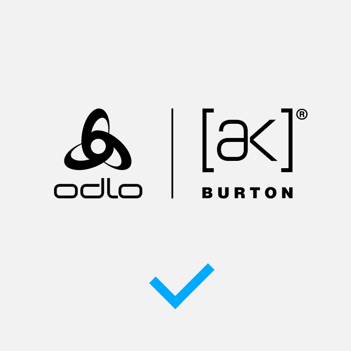
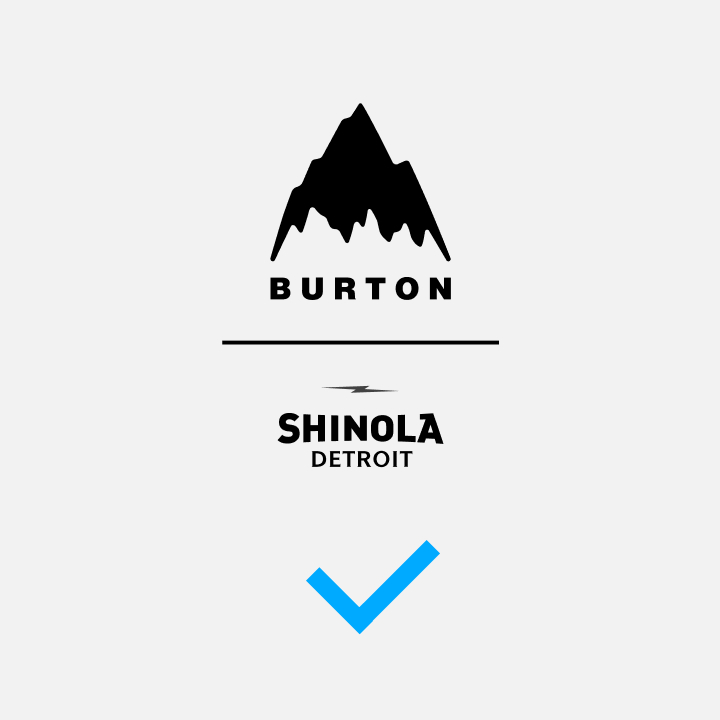
Partnership identities always require a separator when using both logos.
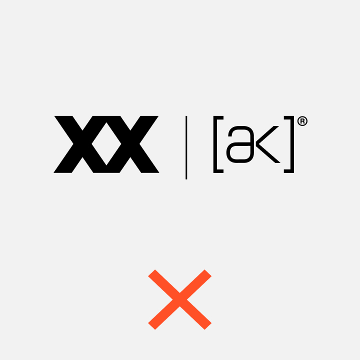
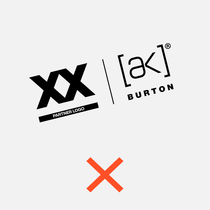
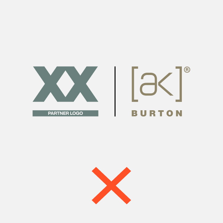
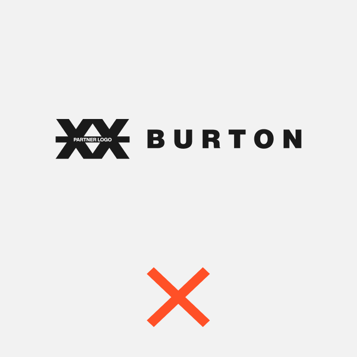
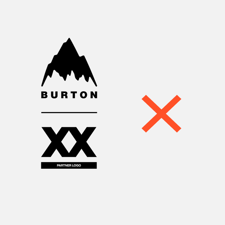
Misuse
Do not merge or integrate elements.
Application
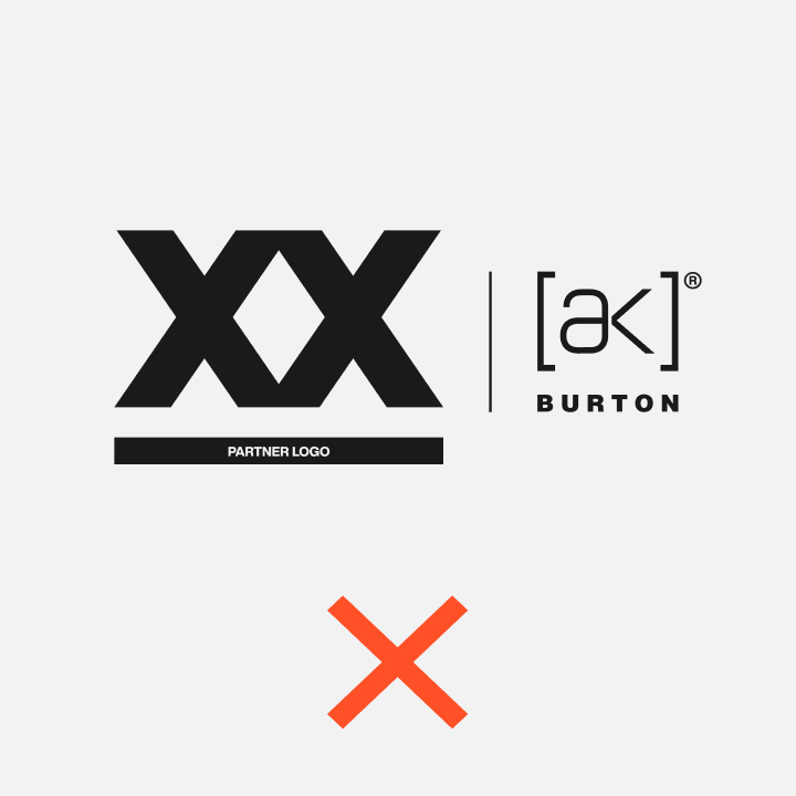
Partnership Pairing Logo Construction
Preferred: Horizontal
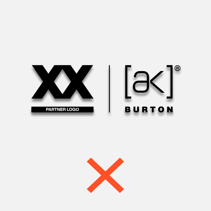
Vertical & Square Partner Logos
Should be the same height as the Burton logo they are being paired with.
Horizontal Partner Logos
Should be inset five units from the top and bottom of the Burton logo they are being paired with.
Partnership Pairing Logo Construction
Acceptable: Vertical
Application
The partner logo should be the same width as the Burton logo it is being paired with.
Misuse
Vertical Examples