Logos
Our new identity is founded upon our heritage but aimed towards the next era of Burton.
Our Logo
The mountain has been part of our identity since we first started standing sideways. We’ve had many logos over the years, and this final Mountain Logo was adapted to shed some of the features and attributes that weren’t well suited for a modern identity. The standards applied to this Mountain Logo also address shape and scalability, ensuring that the logo reproduces across all applications while retaining key attributes of its shape that make the mountain our own.
Our Logo System
Our branding system is comprised of four marks:


Learn More
Mountain Logo
The mountain logo is our primary mark. We should always use this logo whenever possible.
Construction
Our logo was carefully constructed on a grid to maintain balance between the shape, symmetry, and the wordmark underneath. The space and balance between these elements should never be adjusted or altered.
Clear Space
Based on the grid the logo is constructed on, the wordmark is three units tall. The minimum clear space around the logo is 4 units or 1.33× taller than the cap-height.
Horizontal Logo
This is our Secondary logo.
When vertical space is limited and both the mountain and wordmark need to be represented side by side, use the horizontal logo.
Construction
The secondary logo is constructed by combining the bar logo with the mountain icon and removing the bar logo container shape.
Clear Space
Based on the grid the logo is constructed on, the cap height of the wordmark is 6 units tall. The minimum spacing around the logo should be at least 2 units top, bottom, and left, or ⅓ the height of the letters, and 4 units on the right side, or ⅔ the height of the letters
New Bar Logo & Mountain Icon
These are our two tertiary logos.
Sometimes our logo needs to be separated or contained. When vertical space is limited or stylistic context requires it, the new bar logo may be used. The mountain icon must still be present elsewhere on the application whenever the new bar logo is used.
Construction
The new bar logo was constructed on the same grid as the updated mountain icon. The spacing around the type was re-balanced and the tracking decreased slightly in to provide an overall shape that is easier to use in application.
Clear Space
Based on the grid the logo is constructed on, the cap height is 6 units tall. The minimum spacing around the logo should be at least 2 units, or ⅓ the height of the letters.
Icon Construction & Clear Space
The icon construction is the same as the mountain logo without the type. The mountain should be no larger than 75% of the width or height of its containing shape.
Usage Exceptions and Considerations
There are a few instances where exceptions to usage rules or additional consideration is needed when using our new logos.
New Bar Logo Container
When the application for the bar logo is more than 3x longer than it is tall, it is acceptable to use that shape as a substitute for the new bar logo container.

Misuse
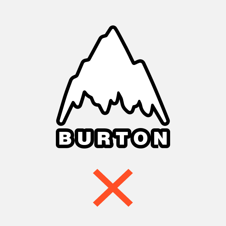
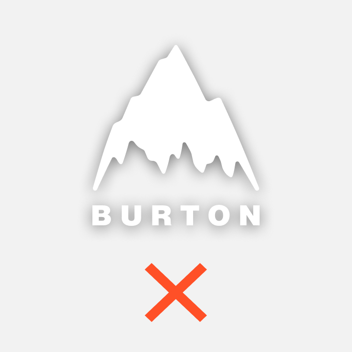
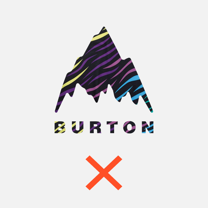
Do not crop the logo. Do not distort its proportions. Do not change the transparency of the logo. Do not use drop shadows or other effects. Do not change the color of the logo. Do not re-typeset the wordmark. Do not outline. Do not change the size or position of the mountain or any other part of the logo.
For Small Size Use
The smallest size the mountain logo should be reproduced is 36px on screen, 16px for the mountain icon.
When the application size is a constraint it may be appropriate to just use the mountain icon, a website fav-icon for example. Usage exceptions across channels may also differ. For example social media platforms that display the name Burton next to the icon need only use the mountain icon. There is no need to repeat the Burton name in the icon.
You can download the latest Burton logo files via the button below.
Logo Summary
01
Always Start with the Mountain Logo
03
When using the bar logo, ensure the mountain icon is also represented elsewhere within the application.
02
Use the Secondary logo only when space is limited and the mountain and bar are required.
04
Never alter or adjust any of these marks in any way.
Collections
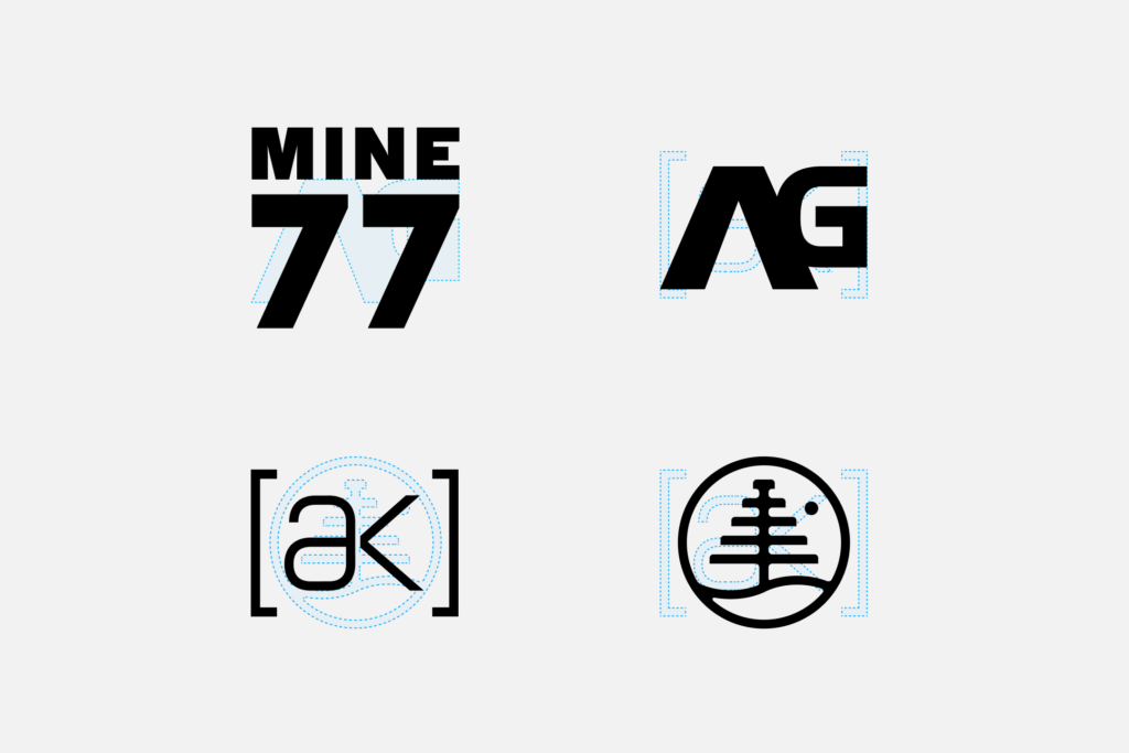
Our product collections and identities represent a unique experience within our brands offering. These collections are unique identities by design. They are related back to the primary brand and brand mark but signify a change in product experience beyond our normal product offering.
Our four primary product identities are MINE 77, AG, [ak]®, and Family Tree. These identities have been around for a long time and each have their own recognizable features however we have slightly refined each mark to align to one another and our new brand identity.
MORE ABOUT MINE 77
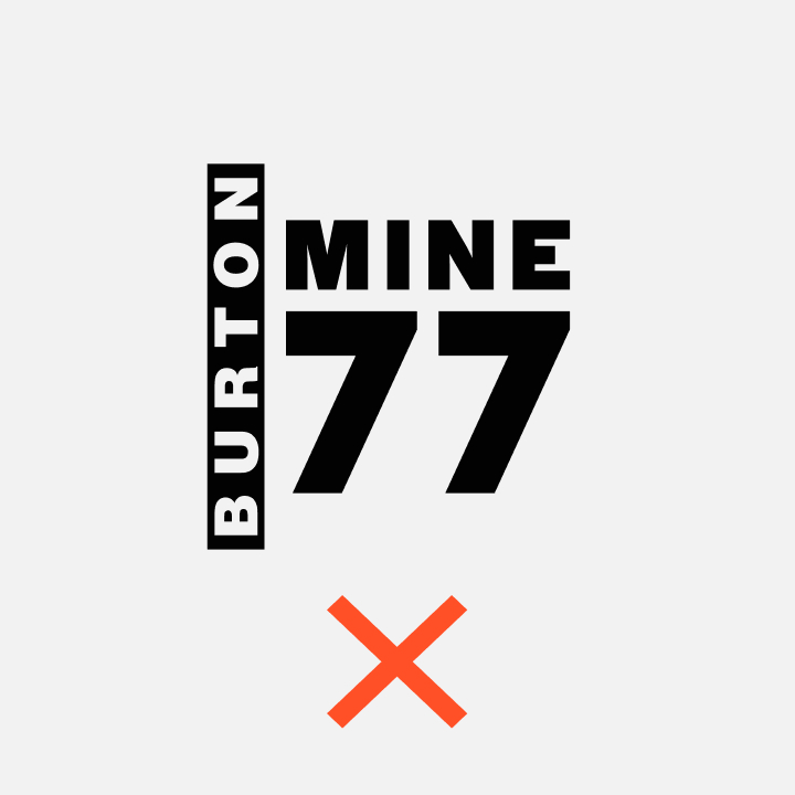
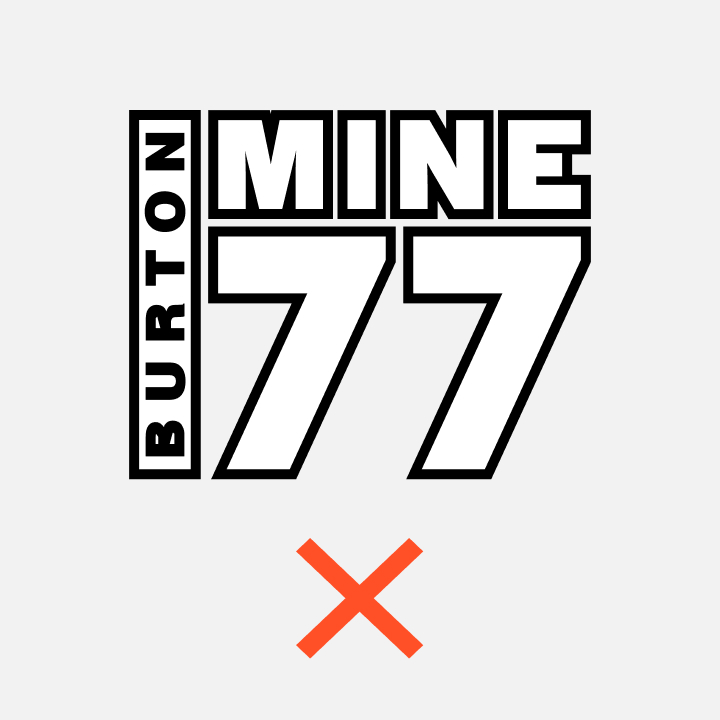
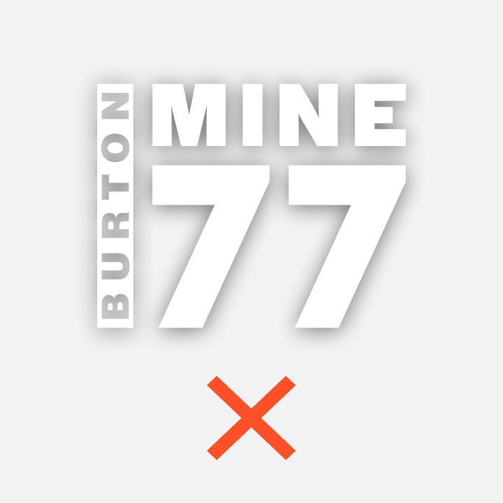
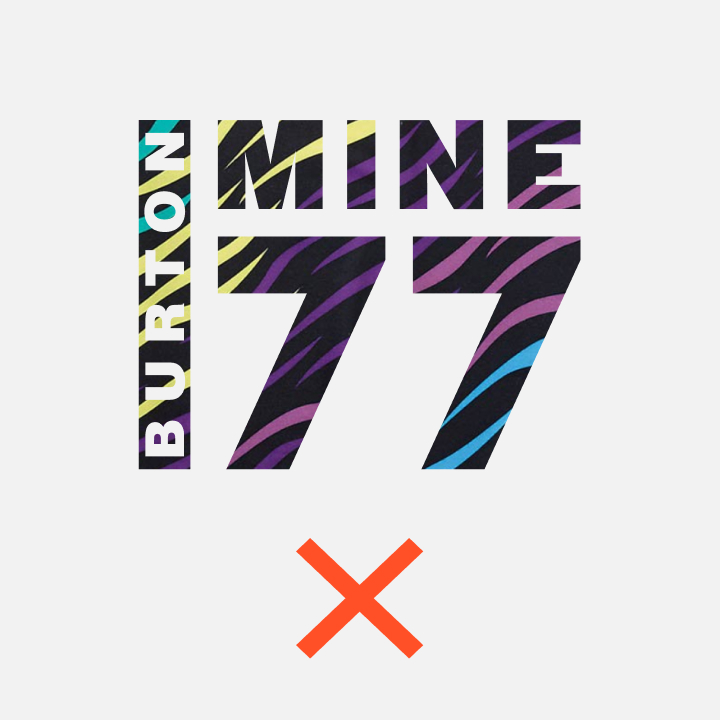
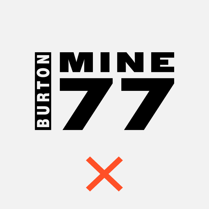
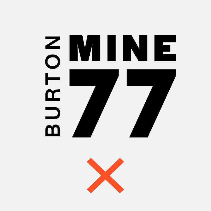
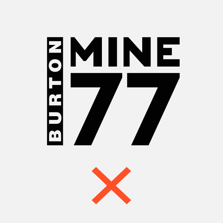
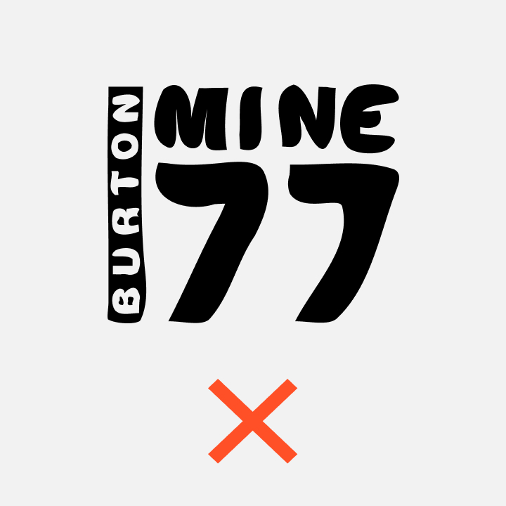
MINE 77
The MINE 77 branding system is comprised of two marks, a horizontal and vertical version always locked up with the Bar Logo.
Vertical Logo – Primary
The vertical MINE 77 logo is the primary mark. We should always use this logo whenever possible.
Clear Space
Based on the grid the primary logo is constructed on, the cap height of the bar logo is 3 units tall. The minimum spacing around the logo should be at least 4 units top, bottom, and left.
Horizontal Logo – Secondary
When vertical space is limited the MINE 77 symbol and Bar Logo may be represented stacked vertically.
Clear Space
Based on the grid the logo is constructed on, the cap height of the wordmark is 6 units tall. The minimum spacing around the logo should be at least 2 units top, bottom, and left, or ⅓ the height of the letters, and 4 units on the right side, or ⅔ the height of the letters
Misuse
Do not crop the logo. Do not distort its proportions. Do not change the transparency of the logo. Do not use drop shadows or other effects. Do not change the color of the logo. Do not re-typeset the wordmark. Do not outline. Do not change the size or position of the Family Tree symbol or any other part of the logo.
MORE ABOUT AG
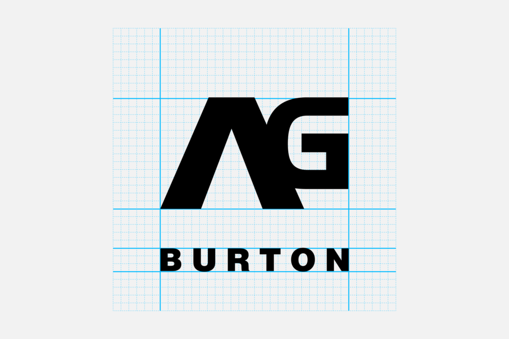
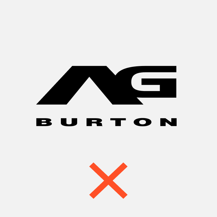
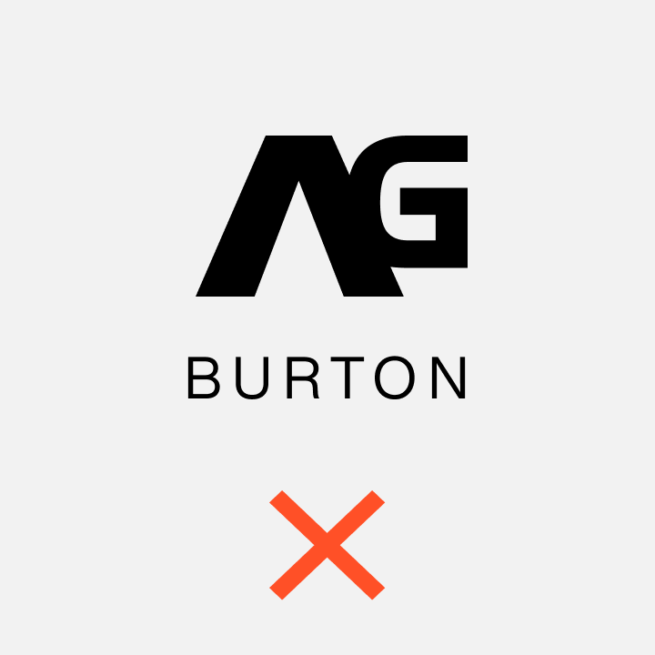
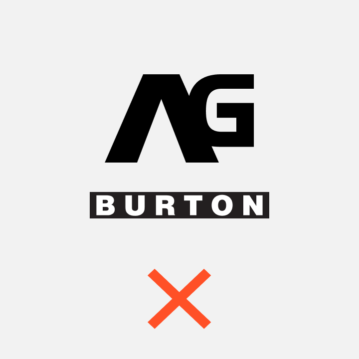
AG
The AG branding system is comprised of two marks, a horizontal and vertical version always locked up with the Burton wordmark.
Vertical Logo – Primary
The vertical AG logo is the primary mark. We should always use this logo whenever possible.
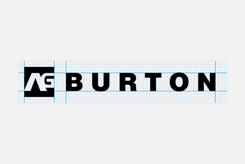
Horizontal Logo – Secondary
When vertical space is limited the AG logo and Burton wordmark may be represented side by side.
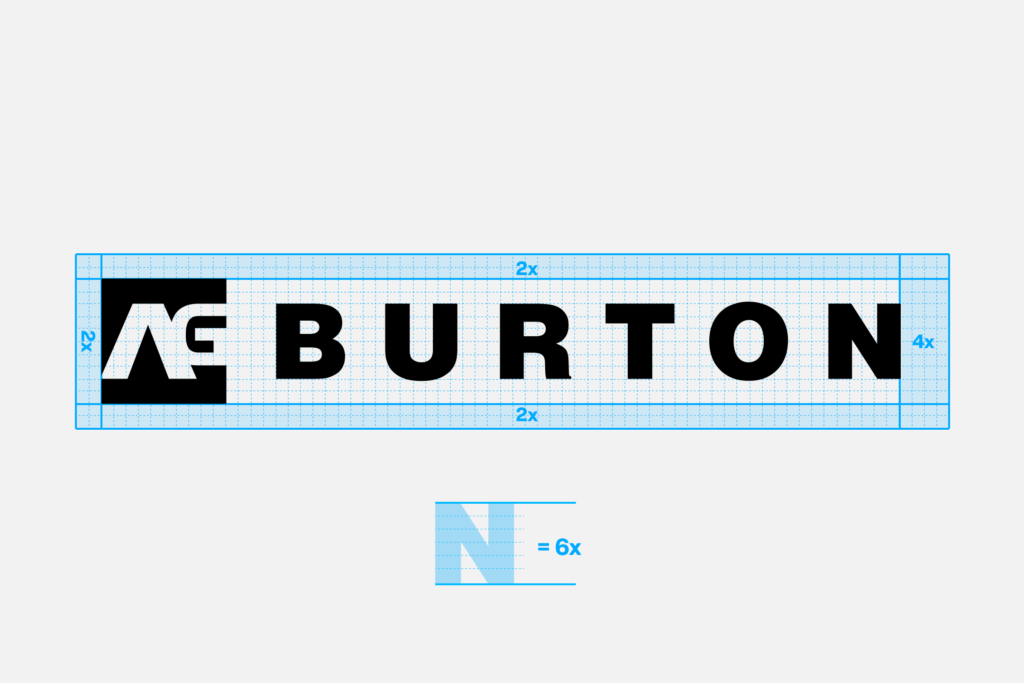
Clear Space
Based on the grid the logo is constructed on, the cap height of the wordmark is 6 units tall. The minimum spacing around the logo should be at least 2 units top, bottom, and left, or ⅓ the height of the letters, and 4 units on the right side, or ⅔ the height of the letters
Misuse
Do not crop the logo. Do not distort its proportions. Do not change the transparency of the logo. Do not use drop shadows or other effects. Do not change the color of the logo. Do not re-typeset the wordmark. Do not outline. Do not change the size or position of the AG symbol or any other part of the logo.
MORE ABOUT [ak]®
[ak]®
The [ak] branding system is comprised of two marks, a horizontal and vertical version always locked up with the Burton wordmark.
Vertical Logo – Primary
The vertical [ak] logo is the primary mark. We should always use this logo whenever possible.

Horizontal Logo – Secondary
When vertical space is limited the [ak] logo and Burton wordmark may be represented side by side.

Clear Space
Based on the grid the logo is constructed on, the cap height of the wordmark is 6 units tall. The minimum spacing around the logo should be at least 2 units top, bottom, and left, or ⅓ the height of the letters, and 4 units on the right side, or ⅔ the height of the letters

Misuse
Do not crop the logo. Do not distort its proportions. Do not change the transparency of the logo. Do not use drop shadows or other effects. Do not change the color of the logo. Do not re-typeset the wordmark. Do not outline. Do not change the size or position of the [ak] symbol or any other part of the logo.
MORE ABOUT FAMILY TREE
Family Tree
The Family Tree branding system is comprised of two marks, a horizontal and vertical version always locked up with the Burton wordmark.
Vertical Logo – Primary
The vertical Family Tree logo is the primary mark. We should always use this logo whenever possible.

Horizontal Logo – Secondary
When vertical space is limited the Family Tree symbol and Burton wordmark may be represented side by side.

Clear Space
Based on the grid the logo is constructed on, the cap height of the wordmark is 6 units tall. The minimum spacing around the logo should be at least 2 units top, bottom, and left, or ⅓ the height of the letters, and 4 units on the right side, or ⅔ the height of the letters

Misuse
Do not crop the logo. Do not distort its proportions. Do not change the transparency of the logo. Do not use drop shadows or other effects. Do not change the color of the logo. Do not re-typeset the wordmark. Do not outline. Do not change the size or position of the Family Tree symbol or any other part of the logo.
Logo Files
You can download the latest product logo files via the button below.
Collection Identities Summary
01
Always include the Burton wordmark.
02
Always start with the vertical logos.
03
Use the horizontal logo only when space is limited.
04
Never alter or adjust any of these marks in any way.
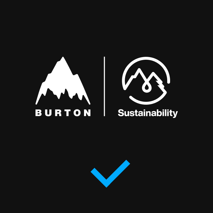
Sustainability Identity
The Sustainability identity is an integral part to the communication strategy of our brand purpose efforts. The following guides are to ensure consistent placement and standardize usage of the Sustainability visual identity across all applications.

This is the primary logo lockup and should always be implemented wherever possible.
MORE ABOUT BURTON SUSTAINABILITY
Construction
Our Sustainability logo lockup was carefully constructed on a grid to maintain balance between the shape, symmetry, and the wordmark underneath. The space and balance between these elements should never be adjusted or altered.

Clear Space
Based on the grid the logo lockup is constructed on, the wordmarks are three units tall. The minimum clear space around the logo is 4 units or 1.33× taller than the cap-height.
Vertical Logo
This is the secondary sustainability logo lockup and should only be used when horizontal space is limited.

Vertical Logo Construction
Our Sustainability logo lockup was carefully constructed on a grid to maintain balance between the shape, symmetry, and the wordmarks. The space and balance between these elements should never be adjusted or altered.

Vertical Logo Clear Space
Based on the grid the logo lockup is constructed on, the wordmarks are three units tall. The minimum clear space around the Sustainability logo lockup is 4 units or 1.33× taller than the cap-height on top and bottom and 3 units on the sides.
Color
Brand Color
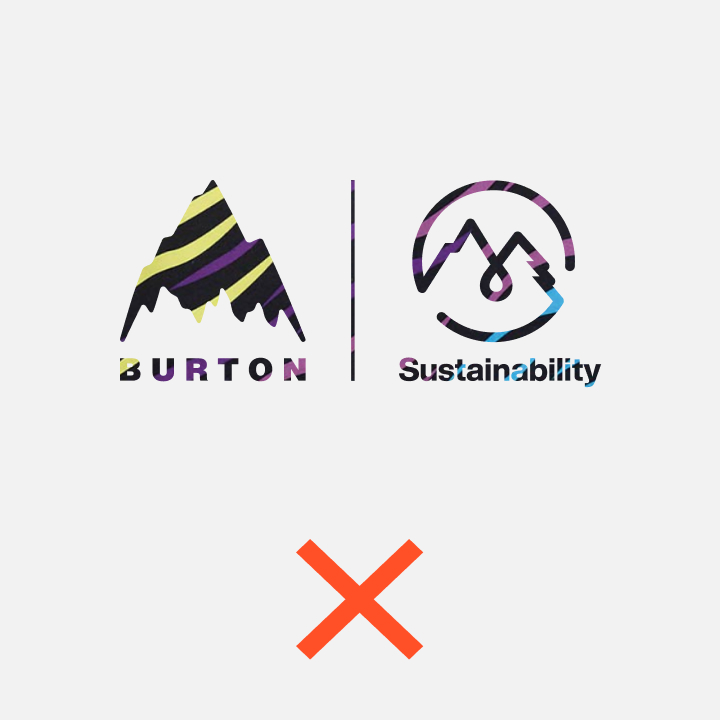
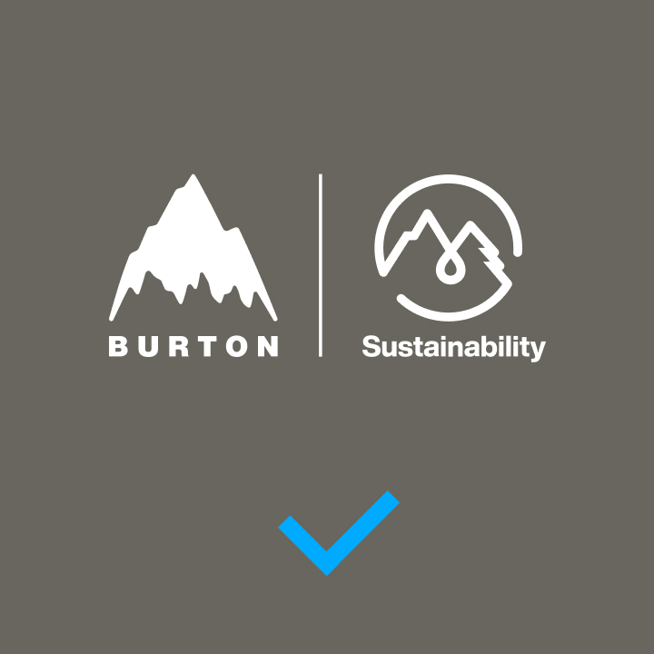
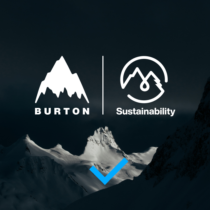
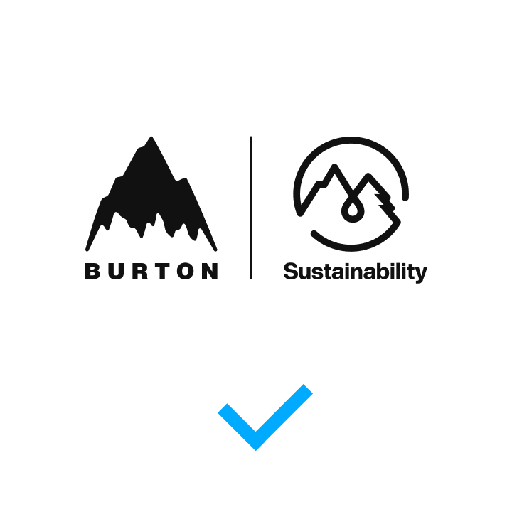
The Sustainability logo lockup is always black and white, or white and black.

Application
Whenever applicable it is preferred to use a one-color, black or white logo on all applications.


Usage
Misuse
Application of the Sustainability logo lockup should be kept straightforward and simple, utilizing only the colors of the identity, and not altering or adjusting it in any way.

or imagery.
Application
Correct logo adjustments based on the application background are outlined below.

You can download the latest sustainability logo files via the button below.